Basic SEC-SAXS processing
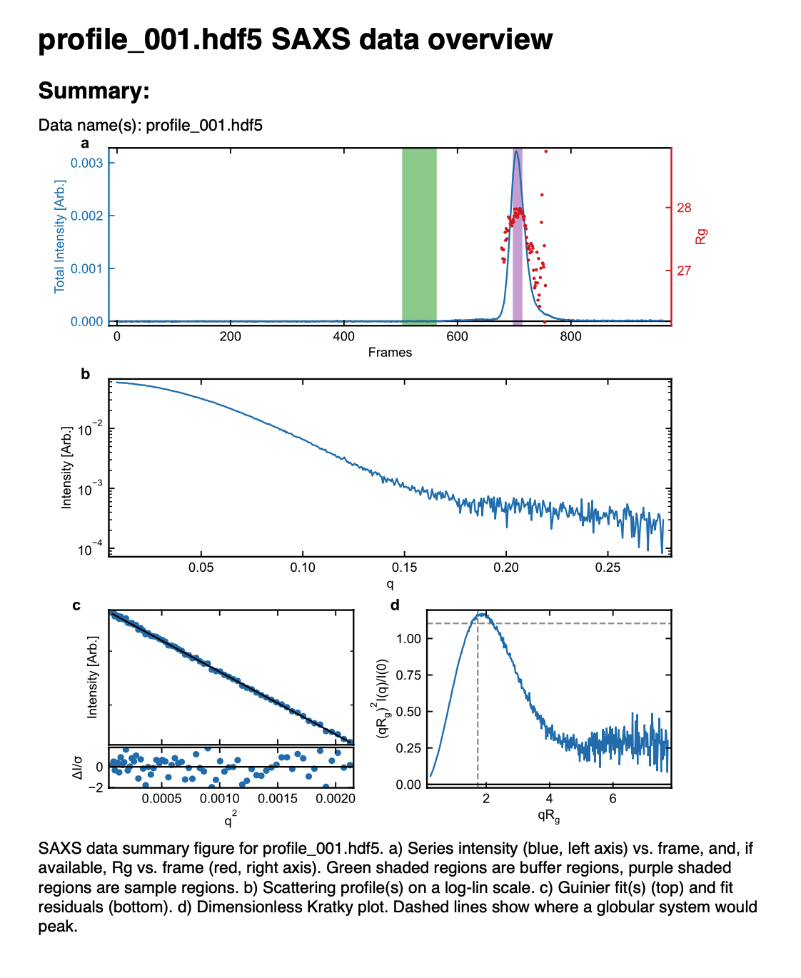
In a typical SEC-SAXS run, images are continuously collected while the eluate (outflow) of a size exclusion column flows through the SAXS sample cell. As proteins scatter more strongly than buffer, a plot of total scattered intensity vs. time, the so-called SAXS chromatograph (or scattergram), will show a set of peaks similar to what is seen by UV absorption measurement of the SEC system. RAW includes the capability to do routine processing of SEC-SAXS data. This includes creating the SAXS chromatograph from the data, plotting Rg, MW, and I(0) across the peaks, and extracting specific frames for further analysis.
Note: In RAW, this is called Series analysis, as the same tools can be used for other sequentially sampled data sets.
A video version of this tutorial is available:
The written version of the tutorial follows.
Clear any data loaded into RAW.
Tip: In the Files tab, click the “Clear All” button to clear all data in RAW.
Go to the Files control tab and navigate to the sec_sample_1 data directory.
Click on the first data file, profile_001_0000.dat. Scroll down to the bottom of the file list, and shift click on the last file, profile_001_0964.dat. This should highlight all of the files in between, as well as the two you clicked on. Click on the “Plot Series” button to load the series into RAW.

RAW should automatically show you the Series plot panel. If not, click on the Series tab in the plot. Click on the Series tab in the control panel.
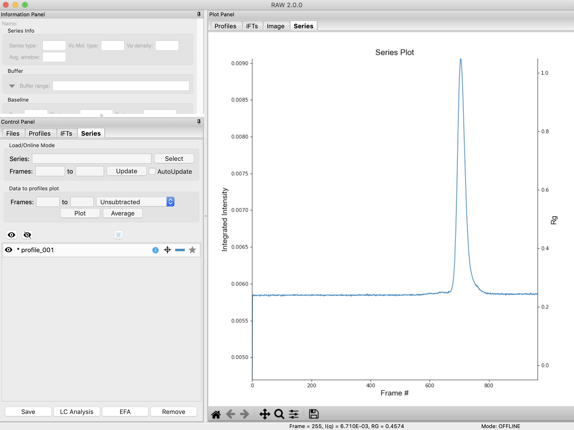
Try: Each point on this curve is the integrated intensity of a scattering profile. You can figure out which one by right clicking on the filename in the Series list and selecting ‘Show data’. This will show you the frame number and integrated intensity displayed on the plot, and the filename corresponding to the displayed frame number.
Drag the plot so that you can clearly the see the first frame. You’ll notice it has a significantly lower intensity than the rest of the frames. This happens occasionally at the MacCHESS G1 beamline (where the data was taken). It can make it harder to tell what the data is doing.
Tip: Select the crossed arrows in the plot control bar, and then click and drag on the plot to move the curve around on the screen.
Reload the data as in steps 2-3, but select the second data file, profile_001_0001.dat as the initial file in the series.
Tip: As before, select profile_001_0001.dat, scroll down to the last file, and shift click to select the files to load in. Then click the “Plot Series” button.
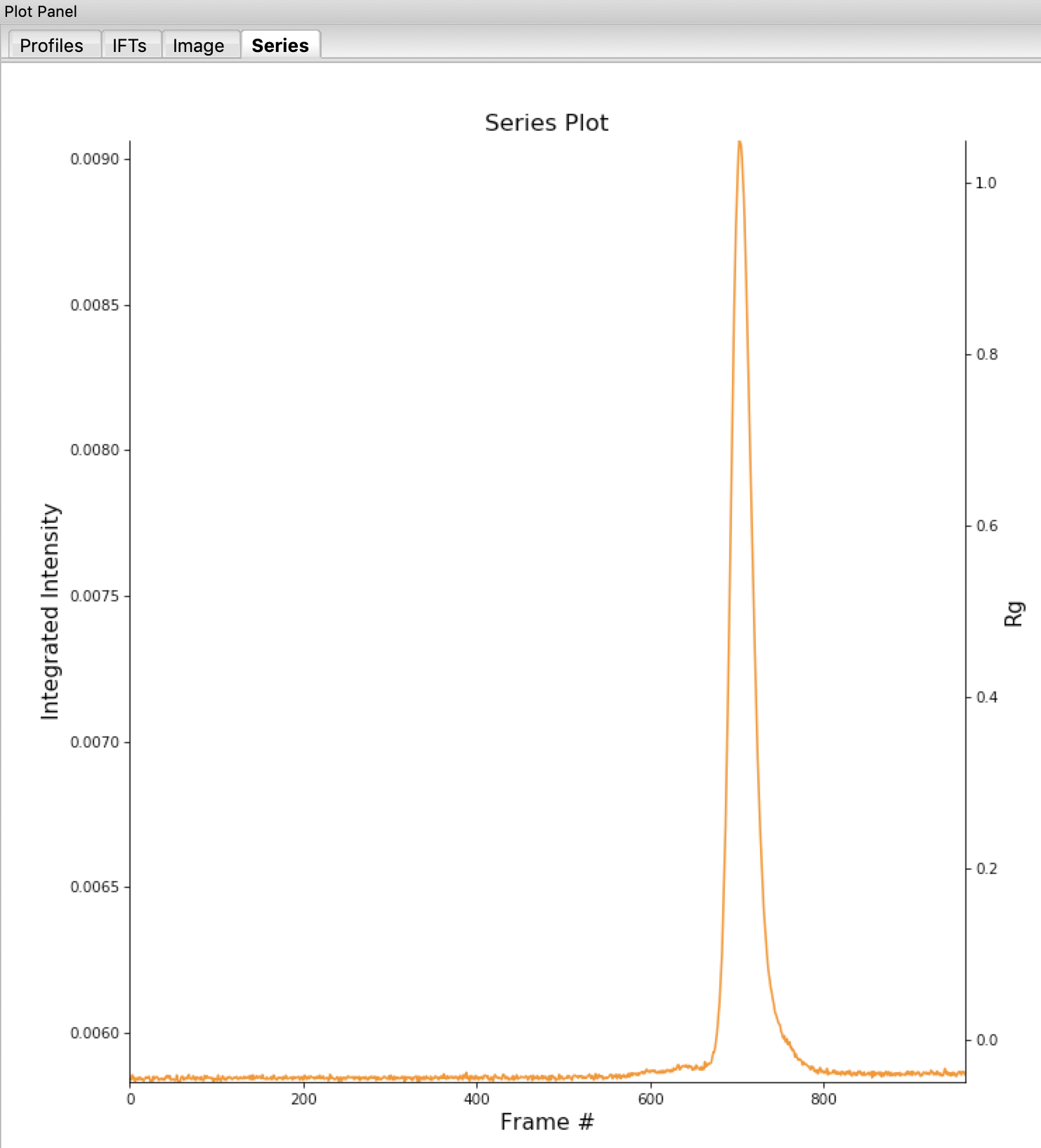
You will see the same curve plotted as before, but without the very first scattering profile. Remove the other loaded data set. Now you should have a curve where the baseline is very close to the bottom of the plot.
In some cases it is more useful to look at the mean intensity, the intensity at a specific q value, or the intensity in a range of q values than the total intensity. Right click on the plot and select mean intensity for the left axis y data. Then try the intensity at q=0.02 and in the q range 0.01-0.03.
Note: You need to have the drag button in the plot control bar unselected to get a right click menu.
Tip: CHROMIXS, in the ATSAS software displays the average intensity over the q range 0.01-0.08 \(Å^{-1}\). To achieve a similar display in RAW, set your q range for the intensity to that. Note that RAW will display the sum of the intensity over the range while CHROMIXS displays mean intensity for the range, so the results won’t be exactly the same.
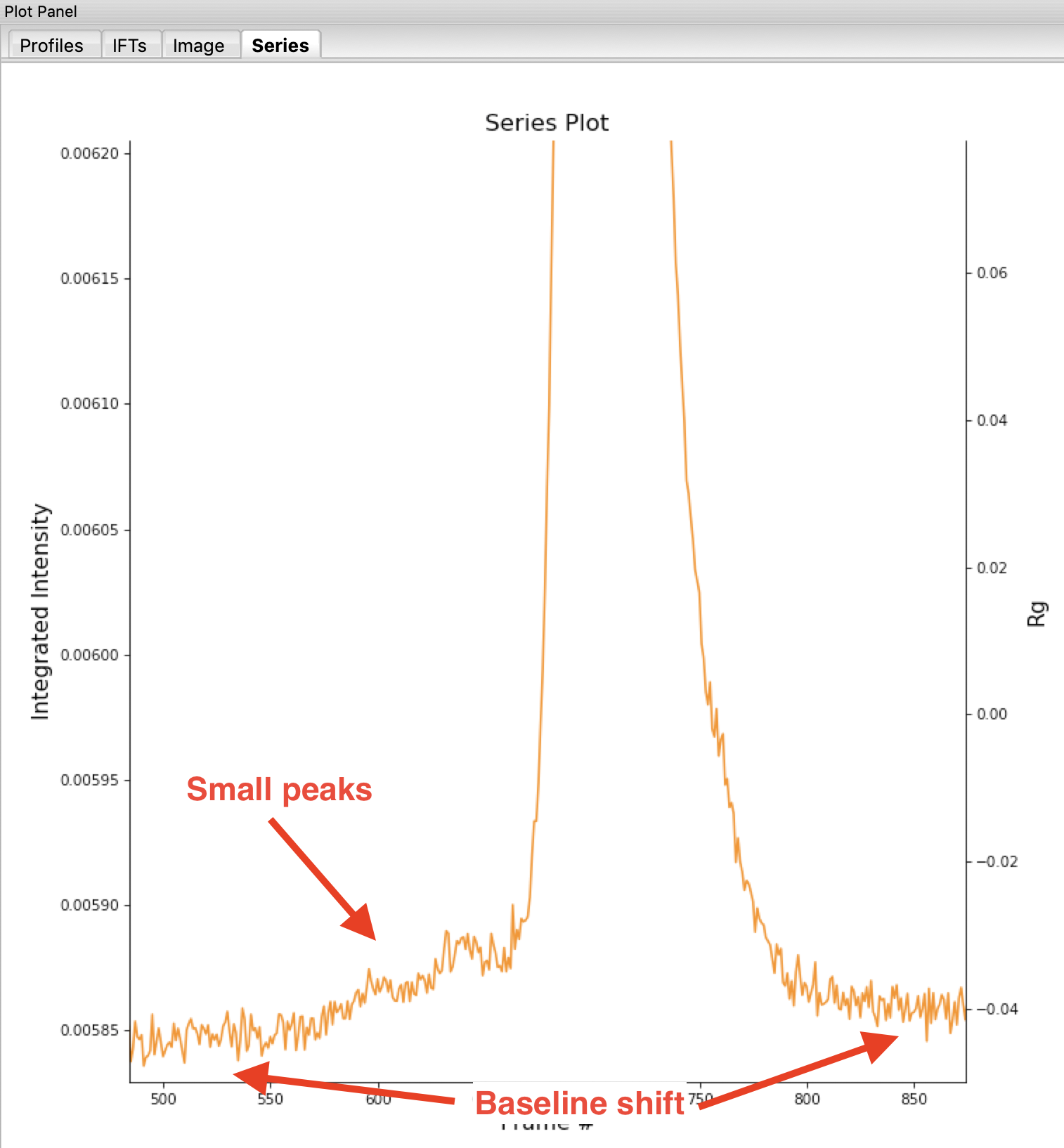
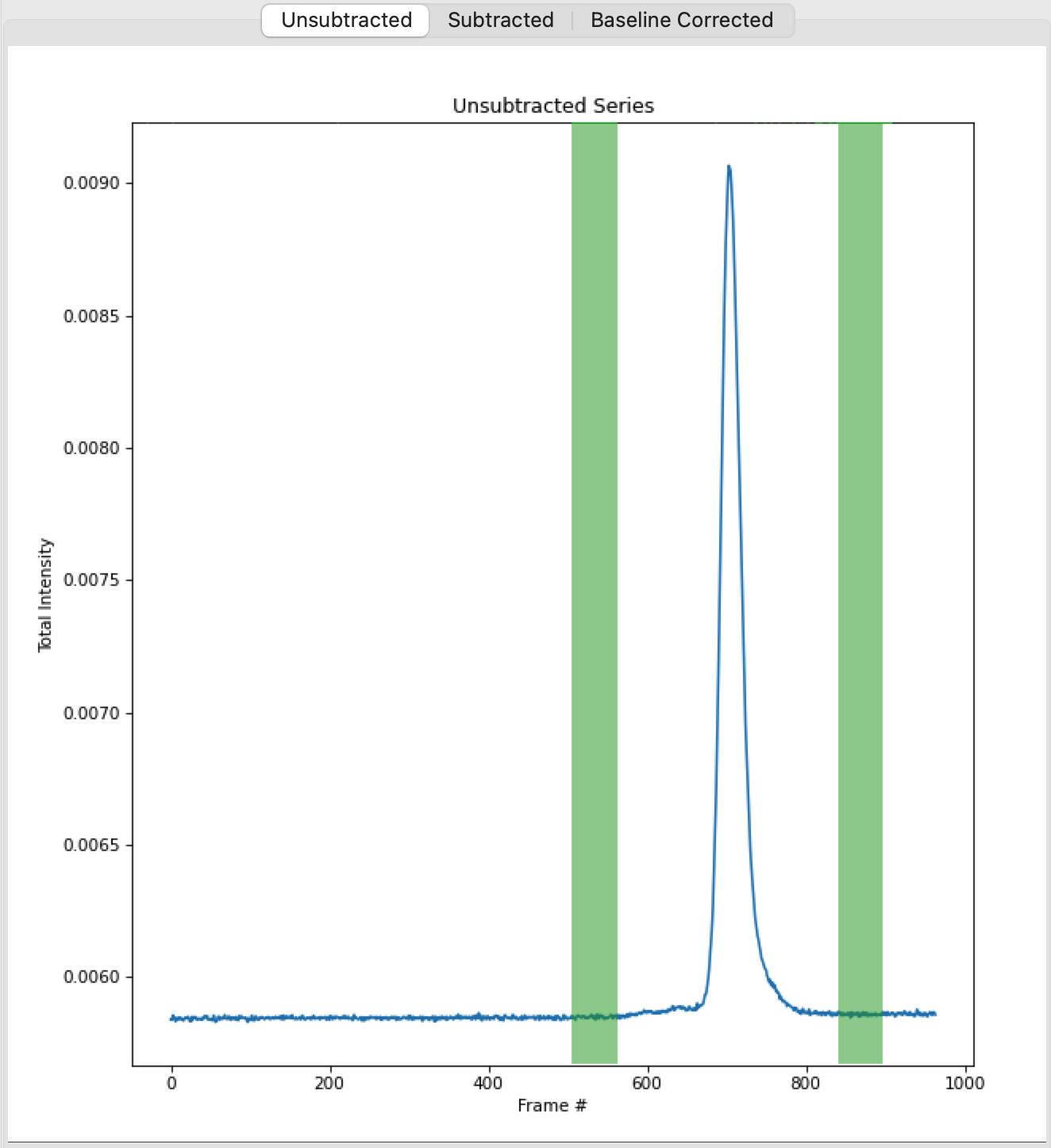
Return to plotting the integrated intensity. Zoom in near the base of the peak. Notice that there are two smaller peaks on the left, likely corresponding to higher order oligomers that we don’t have the signal to properly resolve. Also notice that the baseline after the peak is not the same as the baseline before the peak. This can happen for several reasons, such as damaged protein sticking to the sample cell windows.
Tip: Click on the magnifying glass at the bottom of the plot, then click and drag on the plot to select a region to zoom in on.
Zoom back out to the full plot.
Tip: Click the Home (house) button at the bottom of the plot.
In order to determine if we really have a single species across the peak, we will calculate the Rg and MW as a function of frame number. Click on the “LC Analysis” button at the bottom of the Series control panel or right click on the filename in the Series control panel and select “LC Series analysis” to open the LC Series analysis panel.
Note: At the top of the control panel in this window, in the ‘Series info’ section you’ll see several settings. If you had RNA instead of protein, you would use the Vc Mol. type menu to select that option. This affects the calculation of the molecular weight. You could also change the Vp density away from the default value, or change the averaging window (discussed below).
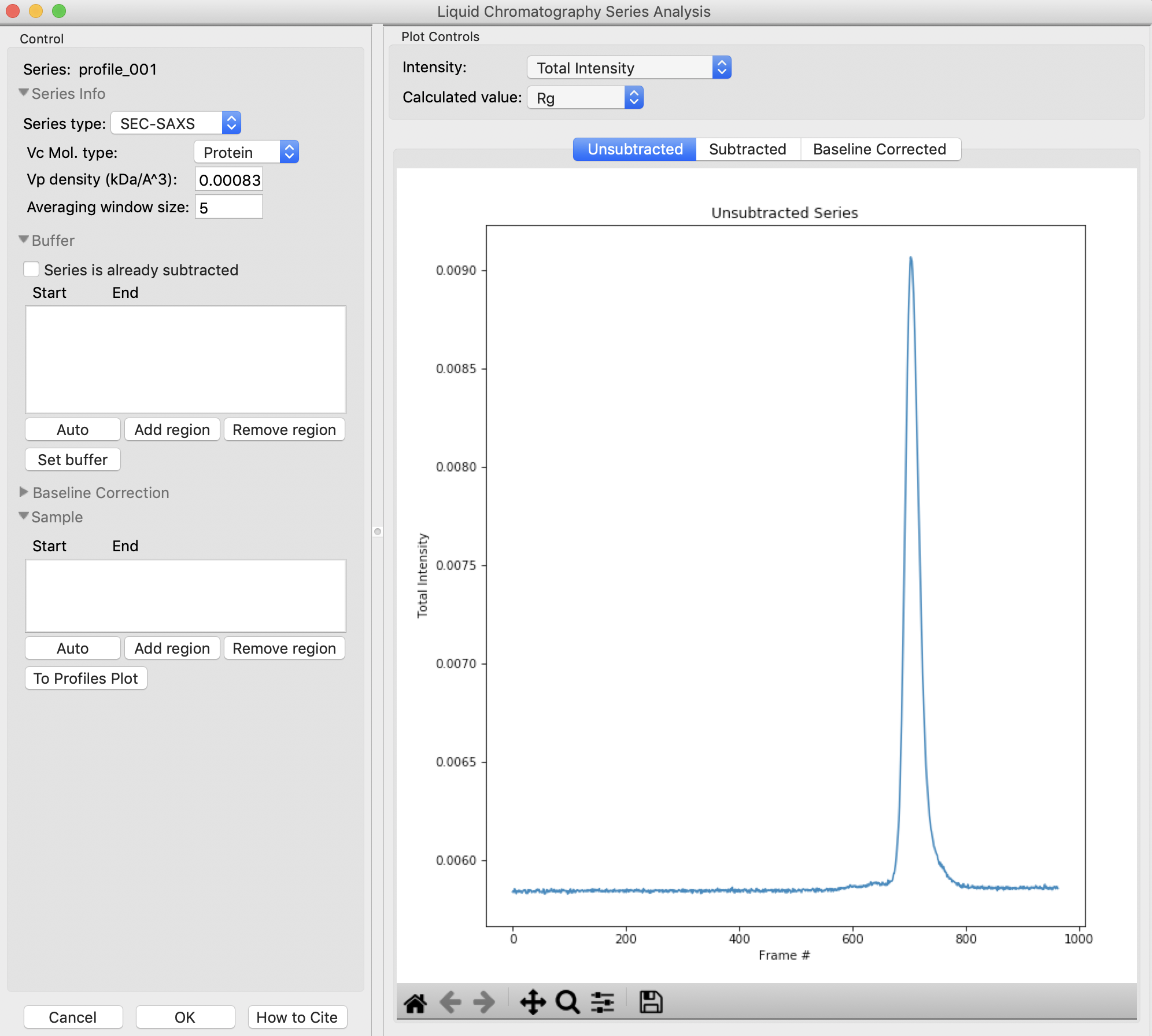
The LC Series analysis panel provides basic and advanced analysis tools for liquid chromatography experiments. Here we will show how to select buffer and sample regions, and send final processed data to the Profiles plot. The advanced baseline correction features are discussed later.
In order to calculate Rg and other parameters as a function of elution time (Frame #), we need to define a buffer region. RAW can do this automatically. In the ‘Buffer’ section click the ‘Auto’ button.
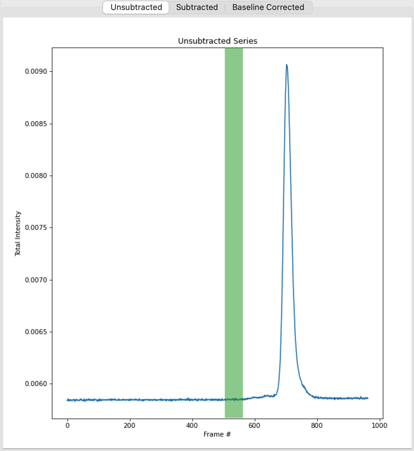
Checkpoint: You should see a buffer range show up in the buffer list, with defined start and end values. The region will be shown in green on the Unsubtracted plot.
You can make fine manual adjustments to the buffer range if necessary. Zoom in on the baseline around the buffer region. Use the up/down arrows for the Start and End points to adjust the buffer region a little bit. You will see the region on the plot update as you make the changes.
Warning: The automatic buffer determination can be wrong! Always be sure to manually inspect the region it picked. In particular, large flat leading edge shoulders next to the main peak can look like a baseline region to the algorithm, and will often mistakenly be picked.
Tip: If the SAXS data isn’t clear (noisy, low signal, etc.), it can be useful to inspect the UV trace associated with the SEC elution to see where there are minor elution components that you should exclude from your buffer selection.
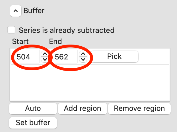
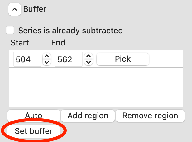
Zoom back out on the plot. Reset the buffer range to 504 to 562 by typing those values in the Start/End range boxes and hitting enter.
To set the buffer region, create a set of subtracted profiles, and calculate structural parameters as a function of elution time, click the ‘Set buffer’ button. This may take a while to calculate.
Note: All of the files in the given buffer range will be averaged and used as a buffer. A sliding average window (size defined by the ‘Averaging window size’ in the ‘Series Info’ section) is then moved across the SEC curve. So for a window of size five, the profiles corresponding to frames 0-4, 1-5, 2-6, etc will be averaged. From each of these averaged set of curves, the average buffer will be subtracted, and RAW will attempt to calculate the Rg, MW, and I(0). These values are then plotted as a function of frame number.
Warning: It is important that the buffer range actually be buffer! In this case, we need to make sure to not include the small peaks before the main peak.
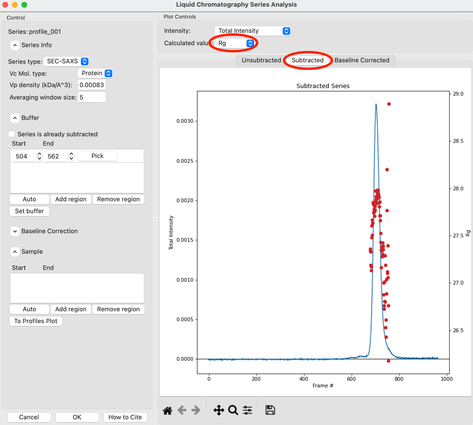
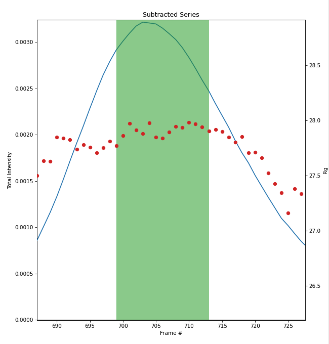
Once the calculation is finished, the window should automatically display the Subtracted plot. If it doesn’t, click on the ‘Subtracted’ tab in the plot. On this plot there is a new Intensity vs. Frame # curve, representing the subtracted data. There is also a set of markers, showing one of the calculated parameters. By default the Rg displayed. The calculated parameters are plotted on the right Y axis. You can show Rg, I(0), and MW calculated by the volume of correlation (Vc) and adjusted Porod volume (Vp) methods. Click on the ‘Calculated value’ menu to switch between the different displays.
Try: Show the Rg, MW (Vc), and MW (Vp). Notice that the MW estimate varies between the two different methods.
Note: You’ll notice a region of roughly constant Rg across the peak. To either side there are regions with higher or lower Rg values. Some of these variations, particularly on the right side, are from scattering profiles near the edge of the peak with lower concentrations of sample, leading to more noise in determining the Rg values. There may also be some effects from the small peaks on the leading (left) side of the peak, and from the baseline mismatch between left and right sides of the peak.
A monodisperse peak should display a region of flat Rg and MW near the center. Note that some spread on either edge can come from small shoulders of other components, bad buffer selection, or just the low signal to noise in the tails of the peak. Zoom in on the Rg and MW values across the peak to verify that these show a significant flat region.
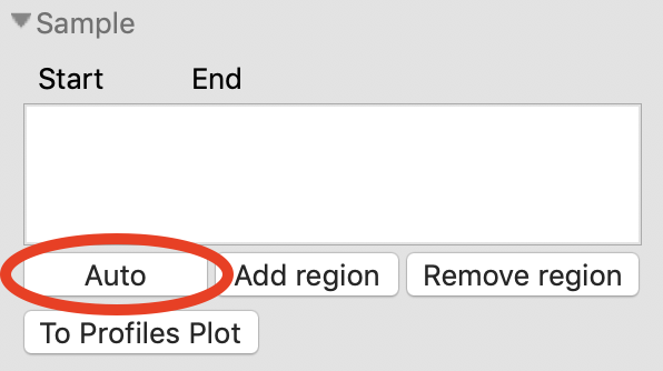
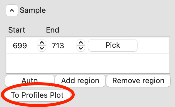
RAW can automatically determine a good sample region (good being defined as monodisperse and excluding low signal to noise data). To do this, click the ‘Auto’ button in the Sample region.
Checkpoint: You should see a sample range show up in the sample list, with defined start and end values. The region will be shown in green on the Subtracted plot.
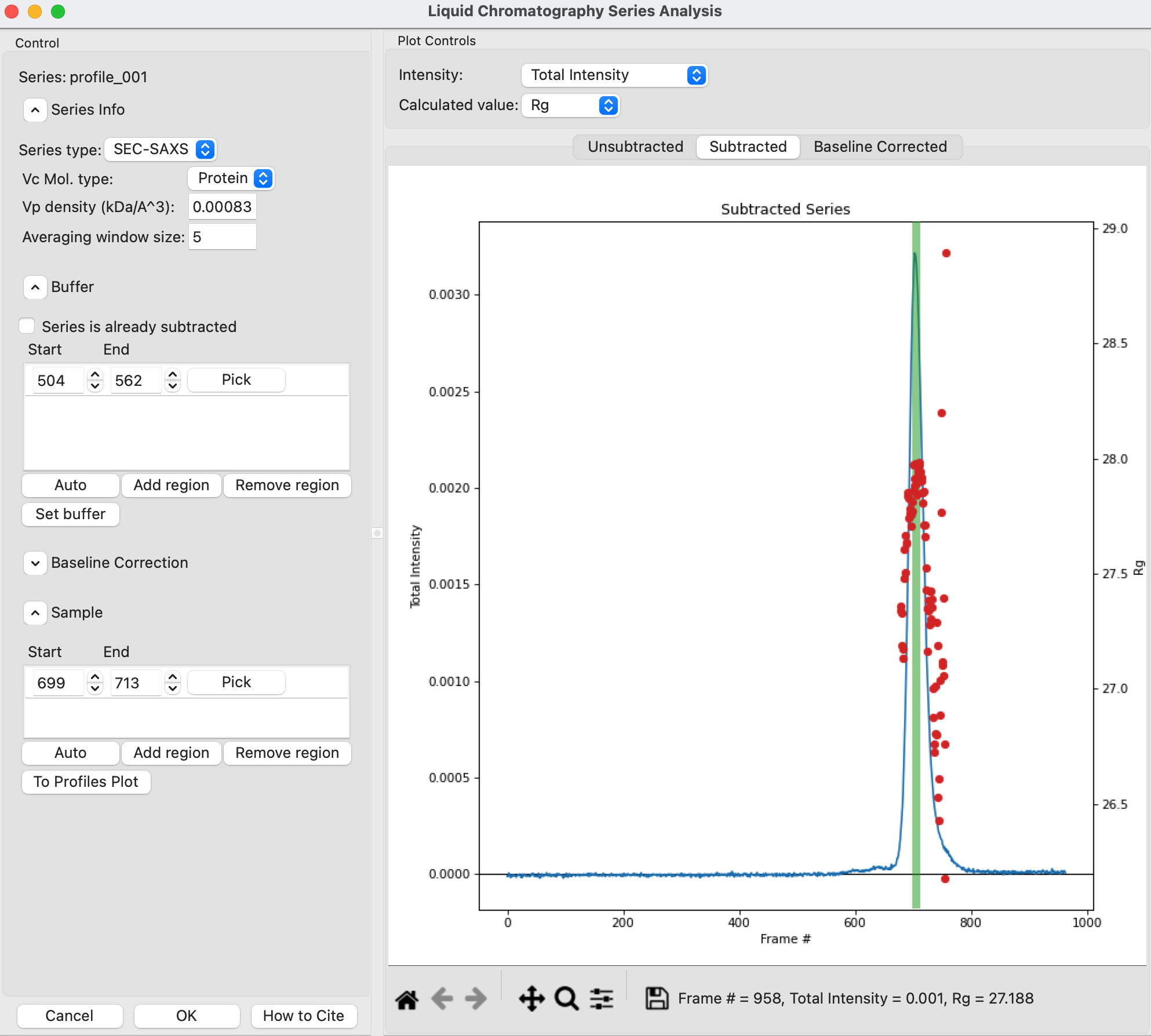
In the plot, zoom in on the peak region and verify that the Rg and MW seem flat in the selected sample range.
Tip: You can manually adjust the sample region range in the same way as the buffer range, using the controls in the Start/End boxes.
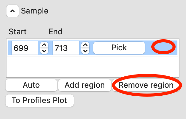
Once you are satisfied with the region picked (should be 699-713), click the ‘To Profiles Plot’ button. This averages the selected region and sends the resulting average to RAW’s Profiles Plot.
Note: RAW first averages the selected sample and buffer regions in the unsubtracted data, then subtracts. This avoids the possibility of correlated noise that would arise from averaging the subtracted files.
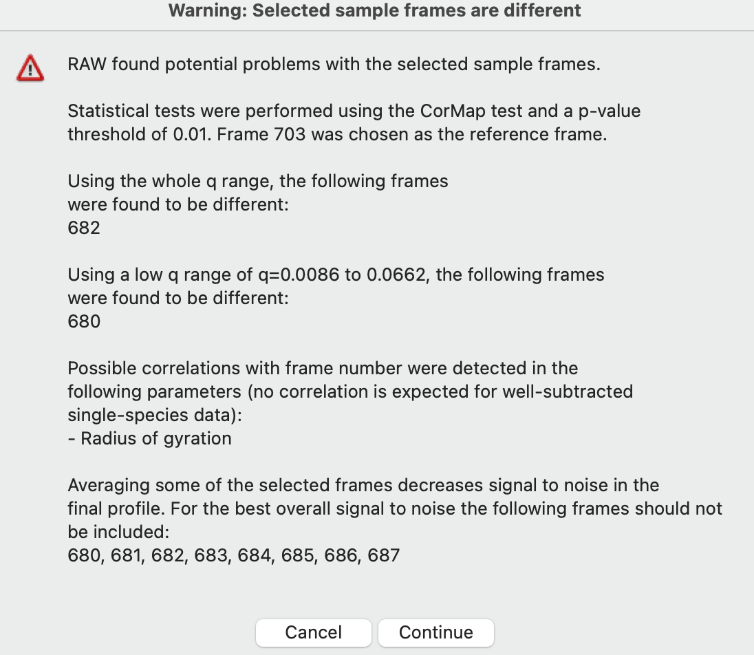
If you adjust the sample or buffer region in a way that could be problematic, RAW will warn you. Try this.
Adjust the Buffer start to include more of the elution range, such as starting at 450. You will want to click on the ‘Unsubtracted’ plot to see the buffer range. Then click ‘Set Buffer’. You will see a warning window telling you what might be wrong with the selected region. Click ‘Cancel’.

Adjust the Sample start to include some of the non-flat Rg region, such as starting at 680. Then click ‘To Profiles Plot’. You will see a warning window telling you what might be wrong with the selected region. Click ‘Cancel’.
Note: For buffer regions, RAW checks frame-wise similarity across the whole q range and at low and high q, correlations in intensity, and whether there are multiple singular values in the selected region.
For sample regions, RAW checks frame-wise similarity across the whole q range and at low and high q, correlations in calculated Rg and MW values, whether there are multiple singular values in the selected region, and if some of the selected frames decrease the signal to noise of the average.
Click ‘OK’ to close the window and save your analysis results. In the Info panel above the Series control panel you should see information about the series, including the selected buffer and sample ranges. If you reopen the LC analysis window you will see the buffer and sample regions you selected are remembered.
Click on the Profiles plot tab and the Profiles tab. You should see one scattering profile, the buffer subtracted data set you sent to the Profiles plot. Carry out Guinier and MW analysis.
Note: The I(0) reference and absolute calibration will not be accurate for SEC-SAXS data, as the concentration is not accurately known.
Question: How does the Rg and MW you get from the averaged curve compare to what RAW found automatically for the peak?
Tip: Make sure your plot axes are Log-Lin or Log-Log. Make sure that both plots are shown by clicking the 1/2 button at the bottom of the plot window.
This particular dataset shows a small difference between initial and final buffer scattering profiles. A better scattering profile might be obtained by using buffer from both sides of the peak. To do so, start by reopening the LC Series Analysis panel.
Switch to showing the unsubtracted intensity by clicking on the ‘Unsubtracted’ plot tab.
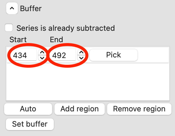
Add a second buffer region by clicking the ‘Add region’ button.
For the second region, click the ‘Pick’ button.
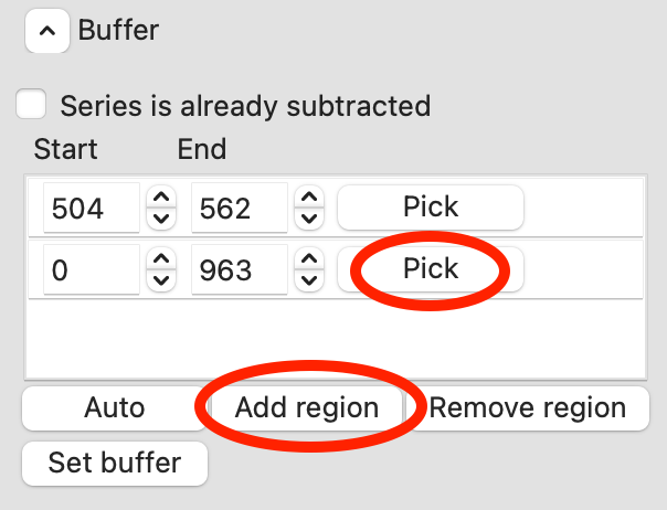
Move your mouse across the plot. You will see a vertical green line moving with the mouse cursor. This represents the start of the buffer region. Click once to fix the start point where you click. Move the mouse further to the right and click again to fix the end point of the buffer region.
Once you are happy with the second buffer region, click ‘Set buffer’. A range like ~840-896 is reasonable.
A warning window will pop up. In this case, we have purposefully chosen two buffer regions because they are different, so ignore the warning and click ‘Continue’.
Remove the old sample region by clicking in the empty space to the right of the ‘Pick’ button to highlight it, and then clicking the ‘Remove region’ button.
Click the ‘Auto’ button to automatically find a new sample region. Click the ‘To Profiles Plot’ button to send that new region to the Profiles plot.
Try: You can see what the data subtracted by just the second buffer region looks like by removing the first buffer region, setting the buffer again, finding a new good sample region, and sending new region to the Profiles plot.
Cancel out of the LC Series analysis window. This will not save the changes you made to the buffer and sample regions.
Carry out the Rg and MW analysis on the new curve. How does the scattering profile compare to the one that you generated using only buffer from before the peak?
Tip: You should see subtle but noticeable differences in the Guinier fit.
Note: An alternative approach to using several buffer regions is to use a single buffer region and apply a baseline correction. Both approaches have advantages and disadvantages. If you want to do EFA deconvolution, it is best to not use a baseline correction, however in other cases it will be more accurate as it doesn’t assume a single average buffer across the peak.
Return to the Series control and plot panels.
If you want to look at either individual profiles or the average of a range of profiles you can send profiles to the Profiles plot. To select which series curve to send profiles from, star the series curve of interest.

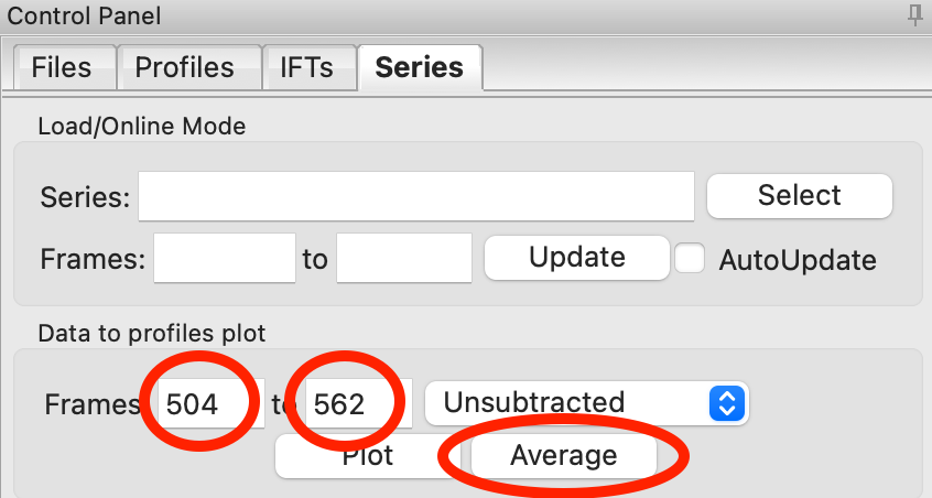
In the ‘Data to Profiles plot’ section enter the frame range of interest. For this dataset, try the buffer range you selected: 504 to 562. Then click the ‘Average’ button. That will send the average buffer to the Profiles plot.
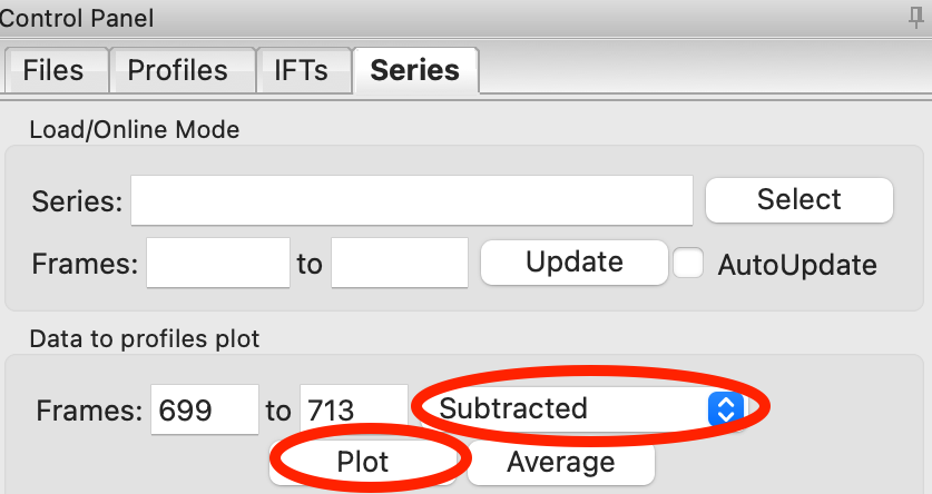
Try: Send the average of the sample range you selected to the main plot (699 to 713), carry out the subtraction, and verify it’s the same as the curve produced by the ‘To Profiles Plot’ button in the LC Series Analysis panel.
Question: When you send the sample average to the Profiles plot you will get a warning that the profiles are different. Why?
You can also send subtracted (or baseline corrected data) to the Profiles plot. For the selected sample range, select the ‘Subtracted’ frames and send each individual profile to the plot using the ‘Plot’ button.
Try: Average these profiles and verify they match the subtracted profiles for this data set generated previously.
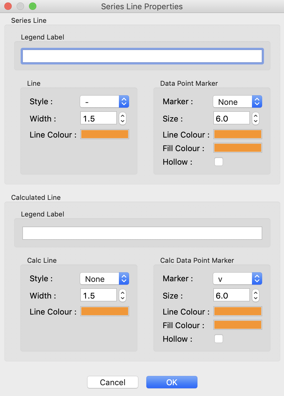
Click on the colored line next to the star in the Series control panel. In the line properties control panel this brings up, change the Calc Marker color to something different. Add a line to the Calc Markers by selecting line style ‘-’ (solid), and adjust the line color to your liking.
Tip: You can do the same thing to adjust the colors of the scattering profiles and IFTs in the Profiles and IFT control tabs.

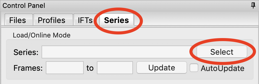
For certain beamlines (the BioCAT beamline at the APS and the MacCHESS BioSAXS beamline at CHESS), RAW can automatically load in series data from the series panel. This is typically used for online analysis while data is being collected, but can be used to load in series you have already collected as well.
We will load in the Bovine Serum Albumin (BSA) SEC-SAXS data contained in the sec_sample_2 data folder using this automatic method. In the Series control panel, click the “Select” button. Navigate to the Tutorial_Data/series_data/sec_sample_2 folder and select any of the .dat files in the folder.
Troubleshooting: If you get an error message, it means you don’t have a configuration file loaded. Load the SAXS.cfg file referenced earlier.
The configuration file must be set to either BioCAT or MacCHESS beamlines for this method to work. Otherwise, RAW doesn’t know how to create all the filenames in a series from a single filename.
The SEC-SAXS run will automatically load. Note that because SAXS data can be reported with an arbitrary intensity scale, the total intensity of this series is much larger than the previous series.
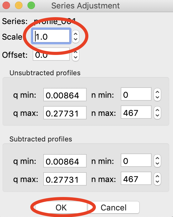
Right click on the profile_001 series and select “Adjust scale, offset, q range”. This will open a window that allows you to adjust the overall scale and offset for your series data, as well as the q range used for each type of profile in the series data. Set the scale to 1800 and click “OK”. You should see that this scales the profiles_001 series to match the BSA series.
Tip: This applies the scale, offset, and q range settings to every profile in the series. So if you were now to send a profile to the Profiles plot, it would have an overall scale factor of 1800 applied to it.
Hide the first series (profile_001).
Select a good buffer region, and calculate the Rg and MW across the peak for the BSA.
Tip: If you hover your mouse cursor over the info icon, you will see the buffer range and window size used to calculate the parameters.
Question: Is the BSA peak one species?
Find the useful region of the peak (constant Rg/MW), and send the buffer and sample data to the Profiles plot. Carry out the standard Rg and MW analysis on the subtracted scattering profile. For BSA, we expect Rg ~28 Å and MW ~66 kDa.
In the Series control tab, right click on the name of BSA curve in the list. Select export data and save it in an appropriate location. This will save a CSV file with the frame number, integrated intensity, radius of gyration, molecular weight, filename for each frame number, and a few other items. This allows you to plot that data for publications, align it with the UV trace, or whatever else you want to do with it.
Try: Open the .csv file you just saved in Excel or Libre/Open Office Calc.
Select both items in the Series control panel list, and save them in the series_data folder. This saves the series data in a form that can be quickly loaded by RAW.
Try: Clear the Series data and then open one of your saved files from the Files tab using either the “Plot” or “Plot Series” button.
Select just the profile_001 item, right click and select “Save report”. Check the profiles associated with the SEC-SAXS series, so that you’re saving a report that includes both the series and the averaged subtracted profile. Save the report as a pdf.